5 Tips for Creating an Alluring Storefront

Foot traffic drives a huge number of sales to brick and mortar stores, and one of the best ways to get foot traffic is to have an attractive storefront. It should make people curious and tempt them to step inside to see what the store has to offer. It can be tricky to get it right because the process of designing a good storefront is so complicated, but there are a few rules of thumb that generally get good results.
Keep it Neat and Clean
A storefront that looks clean and professional will always be more attractive than one that looks dirty or neglected. Anyone can improve their storefront by making a point of cleaning it regularly. Damaged glass and any other visible defects need to get fixed as quickly as possible to make sure that the storefront looks as good as possible. This sort of maintenance does require the business to invest some extra effort, but the return on that investment will often be fairly high.
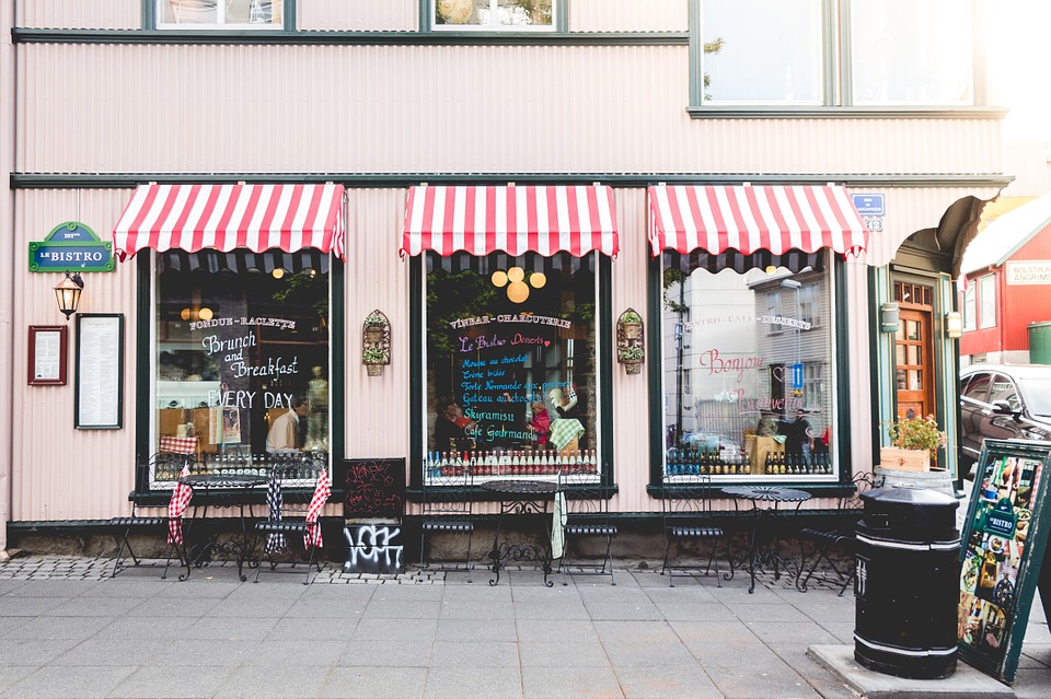
Managers that are creating a new storefront should keep neatness in mind. All of the design elements should work together. For example, it can be useful to study color theory to make sure that all of the colors that are on display look good together. If there are accessories, such as awnings, they should also be coordinated with the color and style of the building to make sure that nothing looks out of place.
Target Your Audience
Most businesses have a few specific target demographics that make up most of their customers. Managers who don’t know their demographics should make a point of researching their customers to get that information.
Understanding demographics is a core part of making an appealing storefront. It is a simple fact of life that no design will appeal to every person because people have different tastes. Fortunately, people tend to be predictable, so preferences within a specific demographic will tend to have a lot of similarities. Designing a storefront that takes advantage of that to appeal to the people that tend to shop in the store will make the building look more appealing to the people who matter the most.
Be Memorable
It pays to stand out from the crowd. A store that looks too much like the buildings next to it will blend in with the environment and that means that less people will notice it. A little bit of color or a unique sign will help people to notice and remember the store. Those are the people who will check it out and might make a purchase.
On the other hand, it is important to remain tasteful. Looking unique to the point that the building looks garish can drive people away. It can be hard to strike a balance between uniqueness and harmony, but doing so is one of the keys to success.
Address the Customers
Most people are more likely to pay attention to messages that seem to be targeted to them than they are to pay attention to things that could apply to anyone. It is possible to create the illusion of a direct message by posting announcements that seem to be talking to the reader. Try to announce sales and post other information with “you” statements. It grabs and holds attention fairly well, and that will bring people into the store.
Understand Your Area
Location is everything for most businesses. Local tastes will dictate what people like to see and what sort of display will draw them into the store. Practical matters, such as the weather, can also determine what sort of external displays are possible. Even local events can have an impact, since they can lead to sudden changes in the way that the area looks that force businesses to adapt.
That means that it is vital to study your area when you are designing the storefront. Keep the environment in mind so that you can figure out which things will work well in your area. When in doubt, keep an eye on what all of the other businesses are doing. They may have some good ideas that you can adapt to your own storefront.


